When you make metal business cards, make sure everything matches your brand to keep your identity strong. Try to balance your design so nothing is too much and everything looks better together. If your design is too complicated, it might make the information hard to understand. So, it’s important to find a good mix between looking good and being clear.
Using different colors that stand out from each other helps make your card easy to read and looks nice. Only put the most important details on your card because too much information can make it confusing. The feel of your card is also important, so choose a finish that adds something special. And remember, a thicker card usually feels like better quality and makes a lasting impression.
Inconsistent Branding Elements
Do your Metal Kards show a consistent brand image, or are there differences that might push potential clients away? For metal business cards, it’s really important that everything looks cohesive and the design is balanced. This helps in making a strong impression. Your cards should clearly show the kind of impact you wish to have, but they should also be simple so clients can easily understand and remember them.
To make sure your branding is cohesive, all parts of your metal business cards like color, where you put your logo, and the type of font you use should match your overall brand identity. When everything matches, it makes your brand look strong and trustworthy to your clients.
Also, it’s important to keep the design balanced so no single part of your card takes over everything else. Getting this balance right means your cards will look good and be easy for people to take in.
Overly Intricate Designs
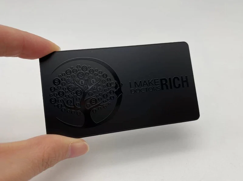
When you make metal business cards, you have to be careful not to put too many complicated designs on them. This can make it hard for the card to do its job, which is to share important info in a clear way. It’s good to find a balance between looking nice and being useful. Even though complex designs look good, they shouldn’t hide the main contact details or the important parts of your brand. To make sure your metal business card looks good and shares info well, try to keep things simple. Use complicated designs only a little bit.
If your design is too complicated, it can confuse the people you give it to. They might find it hard to understand what’s on the card quickly. Remember, sometimes it’s better to keep things simple with metal business card designs. By making things less complicated, you can have a design that looks nice and shares your brand and contact info well. It’s important to find the right mix of nice designs and the need-to-know info to make a good metal business card that people will remember.
Lack of Contrast in Colors
To make your metal business card really stand out, it’s key to focus on the contrast between colors. If colors don’t have enough contrast, it can make the card hard to read and lessen its effect. Having a good mix of colors makes sure people can see what’s on your card clearly. When the colors blend too much, it’s tough for someone to see the details or get what the card is about. Using colors that contrast well doesn’t just help with making things easier to see, but also makes your card look good.
Choosing contrasting colors doesn’t mean your card design has to be complicated. In fact, a simple approach to picking colors that look good together but are different enough can really make your card pop and leave a strong impression on anyone who gets it. Remember, having a color scheme that’s easy on the eyes not only makes your card easier to read but also boosts how eye-catching your design is.
Too Much Text or Information
For creating metal business cards, it’s important to be brief. Concentrate on the main points that clearly share your message.
The way things are arranged by importance helps a lot in catching people’s eyes.
Keep It Concise
Ensure your metal business card is simple yet informative. Choose a design that’s easy on the eyes and maybe a bit different in shape to grab attention. When picking materials and how to print, aim for those that add to the design without making it too busy.
Remember, it’s better to keep things straightforward with business cards. Focus on must-haves like your name, what you do, how to contact you, and your business logo. Don’t pack it with too much info; this might overwhelm or push away potential contacts.
A clear and direct metal business card shows you’re professional and makes it easy for people to see what’s important right away.
Focus on Essentials
When you make your metal business card, it’s really important to not add too much stuff on it. This could make it hard for people to find the important information. Here’s what you should think about:
- Choosing the Right Metal: Pick a good quality metal that shows what your brand is all about.
- Keeping the Design Simple: You want a design that’s easy and clear so people can see the important details easily.
- What to Put on the Card: Just put the most important things like your name, what your company does, and how to contact you.
This way, your metal business card will do its job without confusing anyone.
Visual Hierarchy Matters
To make a good metal business card, it’s important to think about how everything looks so it’s not too crowded. When you design your card, choosing the right fonts and how much space to leave is key. Go for fonts that are easy to read and make sure everything isn’t squished together.
Also, think about how the colors look together and keep a nice balance between words, pictures, and blank space. By picking the right fonts, making sure there’s enough room, choosing colors that look good together, and keeping everything balanced, you can make a metal business card that shares your info well without being too much for the person getting it.

