
The HSL (Hue, Saturation, Lightness) color model offers a user-friendly approach to understanding and manipulating colors based on human perception. Unlike the RGB (Red, Green, Blue) and CMYK (Cyan, Magenta, Yellow, Key/Black) color models, which are often used for technical and printing purposes, HSL aligns more closely with how we naturally perceive and interpret colors.
This makes it particularly useful for design and art applications where intuitive color adjustments are essential. By separating hue, saturation, and lightness, HSL allows for more precise and flexible control over color variations, enhancing the creative process.
Understanding Saturation
Saturation in the HSL color model refers to the intensity or purity of a color. It measures the degree to which a color is undiluted by white light. High saturation means the color is vivid and rich, while low saturation indicates a more washed-out or grayish color.
Visual Representation
To better understand saturation, imagine a color wheel where the central point is a shade of gray (0% saturation) and the outer edge represents the most vivid colors (100% saturation). As you move from the center outward, the colors become more intense. For instance, a fully saturated red will appear bright and vivid, whereas a red with low saturation will appear more muted and closer to gray.
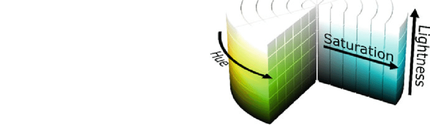
What Does Hue, Saturation, and Lightness Do?
Hue
Hue represents the type of color (such as red, blue, or green) and is determined by the wavelength of light. It is typically described in degrees around the color wheel, ranging from 0° to 360°. For example, 0° is red, 120° is green, and 240° is blue.
Saturation
Saturation indicates the intensity or purity of a color. A color with high saturation is vivid and pure, while a color with low saturation appears more washed out or gray. Adjusting saturation changes how intense the color appears without altering its hue or lightness.
Lightness
Lightness refers to the brightness or darkness of a color. It ranges from 0% (black) to 100% (white), with 50% being the midpoint, representing the pure color. Adjusting lightness changes how much light is present in the color, making it lighter or darker.
What Happens to a Color when you Increase the Saturation?
When you increase the saturation of a color, you enhance its intensity and vividness. The color becomes more pure and less mixed with white or gray. For example, increasing the saturation of a blue color will make it appear more vibrant and bright, whereas reducing the saturation will make it look duller and more muted.
The Importance of Saturation in Color Perception
Psychological Impact
Saturation plays a crucial role in how we perceive and react to colors. Highly saturated colors are often associated with energy, excitement, and attention-grabbing qualities. They can evoke strong emotional responses and are frequently used in marketing and advertising to create a sense of urgency or appeal. In contrast, colors with low saturation can convey calmness, sophistication, or melancholy.
Cultural Significance
Different cultures have varying preferences for color saturation. For example, in some Asian cultures, vibrant, highly saturated colors are often used in festivals and celebrations to signify joy and prosperity. In contrast, Scandinavian design tends to favor muted, low-saturation colors, reflecting the natural landscape and cultural preference for simplicity and minimalism.
Adjusting Saturation in Digital Tools
Most graphic design software, such as Adobe Photoshop and Illustrator, provide tools for adjusting saturation. These tools allow designers to enhance or reduce the intensity of colors in their work. Practical tips for adjusting saturation include using adjustment layers in Photoshop or manipulating the HSL sliders in Illustrator to achieve the desired effect without permanently altering the original image.
Saturation in Practical Applications
Graphic Design
Saturation is a key element in graphic design, used to create emphasis and visual interest. For example, a high-saturation color might be used for a call-to-action button to make it stand out on a webpage. Case studies of successful design projects often highlight the strategic use of saturation to guide the viewer’s attention and create a cohesive visual experience.
Branding and Marketing
In branding and marketing, saturation helps define a brand’s identity. Brands often use highly saturated colors to create a memorable and impactful image. Examples include the vibrant red of Coca-Cola, which conveys energy and excitement, or the rich purple of Cadbury, which suggests luxury and indulgence.
User Interface (UI) Design
In UI design, saturation impacts usability and user experience. High saturation can make interactive elements more noticeable, but overuse can lead to visual fatigue. Guidelines for using saturation in UI design recommend balancing vivid colors with more neutral tones to maintain visual harmony and ensure accessibility.
Challenges and Considerations
Accessibility
Ensuring color accessibility is a significant consideration in design. Individuals with visual impairments, such as color blindness, may have difficulty distinguishing between certain colors. Tools like color contrast checkers and adherence to WCAG (Web Content Accessibility Guidelines) standards help designers create accessible color schemes that accommodate all users.
Color Consistency
Maintaining consistent saturation across different media can be challenging due to variations in display technologies and printing processes. Best practices for achieving color consistency include using standardized color profiles and conducting tests across various devices and print samples to ensure uniformity.
Conclusion
Saturation plays a pivotal role in the HSL color model, influencing both the technical aspects of color manipulation and the psychological impact of colors on human perception. Understanding and effectively using saturation can enhance design projects, create compelling branding, and improve user experiences. According to rgb-hex, new trends in color theory will emerge and the importance of saturation will continue to evolve, offering exciting possibilities for designers and artists alike.